Investors
The problem wasn't the interface. It was how the data came in
An end-to-end redesign of TaxDown's Investments section, the most complex part of the product.
TL;DR
01 · Problem
Our fastest-growing segment was also one of the least satisfied: thousands of brokers, incomplete data from the Spanish Tax Agency (AEAT) and a tax result nobody understood.
02 · Solution
I didn't start with screens: I fixed how the data comes in. I organized the section by institution and designed a system that brings in the information without users having to hunt for it.
03 · Impact
Investor NPS rose +20 points in one year, across all four segments, hitting the goal of matching the rest of our users.
+20.4pts
Investor NPS · 40.1 → 60.5
4of 4
Segments up
93.6%
Complete the section with a pre-filled portfolio, ~3× faster
19.0%
Investor paid conversion, ~2× the average (9.9%)
- Role Product Design Lead
- Team Squad Imagineering
- Platform Desktop · iOS · Android · Responsive
- Timeline Nov 2025 → Jun 2026
01 · Context
Our star segment was also the least satisfied
The company
TaxDown
A Spanish tax platform that guides anyone through filing their income tax return.
The product
Investments & Crypto
Where users report stocks, dividends, funds and crypto. The most complex part of the product.
The opportunity
The star segment
02 · Business problem
Growing fast, but leaving unhappy
Dissatisfaction
33.8 NPS
Investor plan NPS versus ~61 across all users. It was holding back conversion and referrals.
Churn from double checkouts
50% → 75%
50% of users with a Spanish broker were forced to upgrade their plan, and of those, 75% dropped off.
Operations
35–40%
Of support tickets came from technical errors with brokers and documents.
The risk: losing the market share we'd built over four years in our most valuable segment.
03 · User problem
Users wanted to file correctly, but the system neither guided them nor let them check the result
Trust
The result was a black box
0% found the summary sufficient. Only 35.7% fully trusted it; 46.9% trusted it but wanted more detail.
Usability
Lost at every step
Lack of guidance came up in 19% of NPS comments and drove 25–30% of tickets.
Readability
Everything lumped together, no institutions
With several institutions, users couldn't tell what they had or what was missing. And they keep adding more: 1.49 → 1.64 per user on average.
Evidence · I triangulated four sources and they all said the same thing
Intercom 3,000+ conversations
35–40%
of support was due to technical errors (22% of NPS). Lack of guidance was the second pain point: 25–30% (19% of NPS).
Survey 98 users
78.6%
wanted the summary broken down by investment type. 87.7% asked for charts, and 0% were happy with the current one.
Amplitude behavior
84.0%
completed the section when they had to enter data manually, well below everyone else.
Internal teams Tax · Ops · Support
By hand
The tax team filled in missing purchase dates and values case by case.
Constraints · the boundaries I designed within
- Thousands of brokers Each with its own format. Integrating them all was impossible.
- Partial tax data For stocks, the purchase date and value were missing: exactly what's needed to calculate the gain.
- International and crypto outside the Tax Agency Nothing to pre-load: the picture only emerges live, across thousands of transactions.
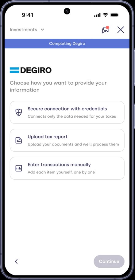
- Three fragile paths Manual entry that was nearly impossible to guide, document parsers with heavy maintenance, and third-party credential connections that almost never worked.
- Fixed tax window Tax season doesn't move: anything not ready had to be solved while users were already filing.
04 · UX Thinking
The symptom was the UX. The root cause was the data.
The team's instinct was to redesign screens. I made the opposite call: fix how data comes in and is organized before touching a single screen, using three levers.
- Lever 01
Investor profile
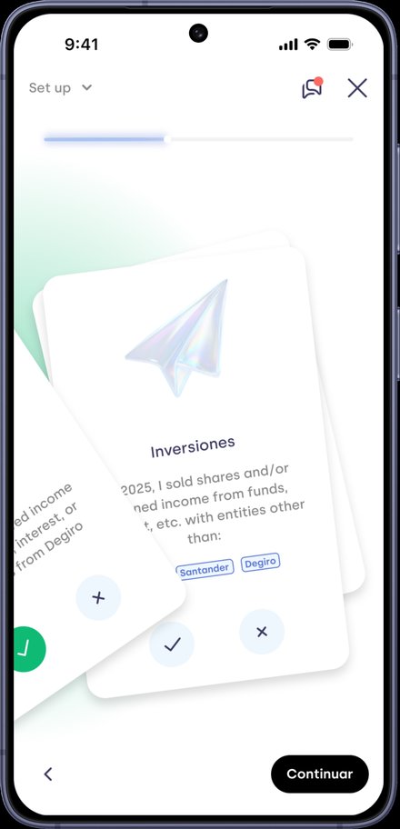
Institutions arrive pre-suggested, never blank.
- Lever 02
Institution-based model
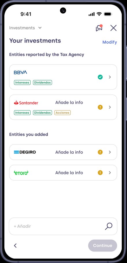
Each one carries its source, its status and what's still missing.
- Lever 03
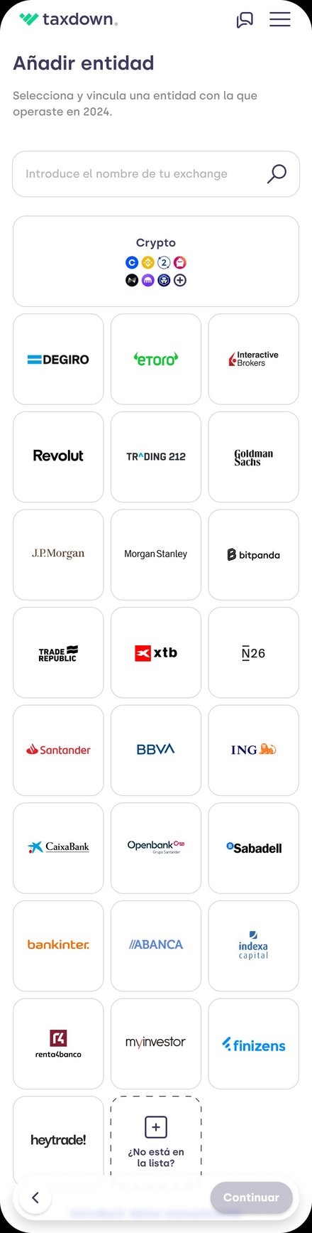
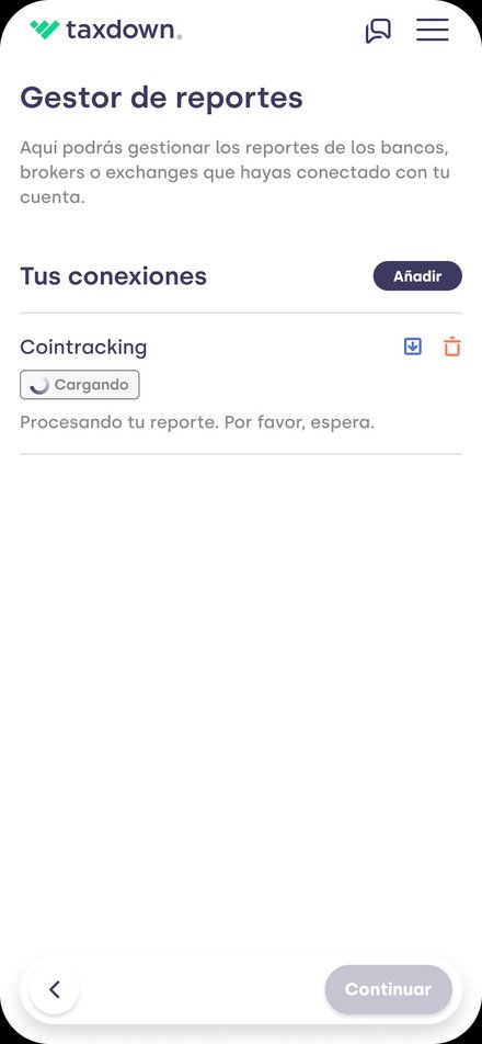
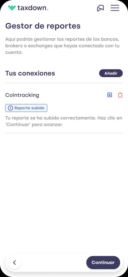
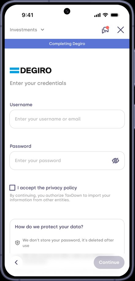
Connections that bring in the data
The Tax Agency's securities portfolio, in-house credential connections and AI-validated report parsing.
The result: a modular system. A new broker or data path slots into the same structure without rebuilding the flow.
User flow
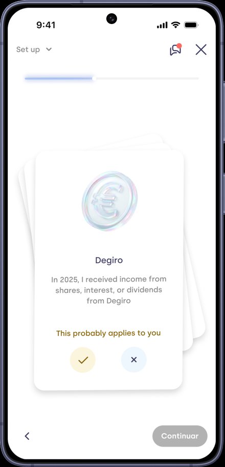
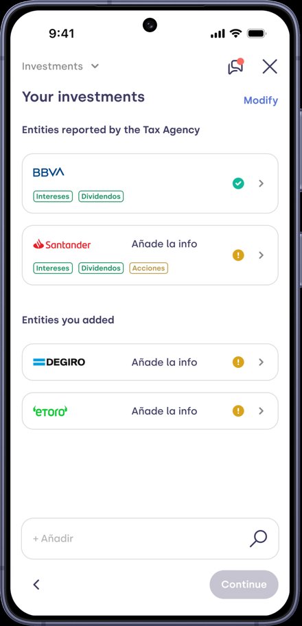
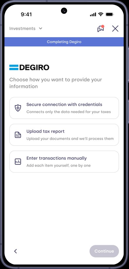
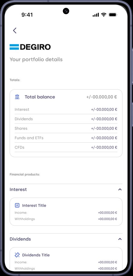
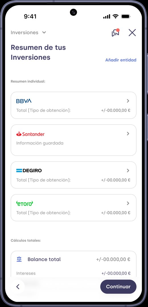
UI design
After
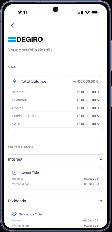
Grouped by institution, auditable
One card per institution with its status, and the total balance below. From each one, users drill down into detail by investment type.
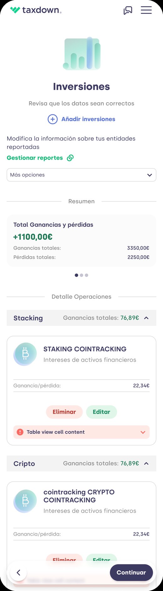
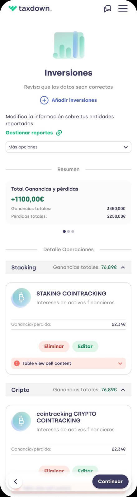
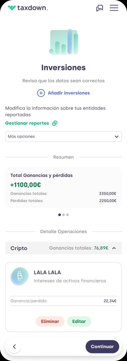
Before
A flat list nobody understood
Data lumped together with no source. 0% found it sufficient, and after adding data, users landed back on the same screen with no idea what had changed.
Design principles
5 principles · tap each one
“Data first, screen second.” No UI gets designed until the data feeding it comes in cleanly and structured.
“The system absorbs the complexity, not the user.” Users only see what they understand and can act on.
“Everything in its institution.” Never lumped together: that way users understand, edit and know what's missing.
“Nothing without explaining where it comes from.” Every figure shows its source and status.
“No dead ends.” If data is missing or a method fails, the system says so and offers an alternative.
Key decisions
Fix the data before the screens
Without good data, there's no summary users can audit.
Organize by institution, with investment type in the detail
Institutions are what scale when a user has many. Since 78.6% wanted the summary by type, I created a summary sub-level that groups by type.
Bring in the data instead of asking for it
The securities portfolio and credentials fill in purchase date and value: the decision is eliminated, not improved.
Validate documents with AI before processing
Feedback before processing, not after failing: fewer re-uploads and tickets.
An institution manager that tells you what's missing
Clarity on what's pending, and no moving forward with half-complete data.
Discarded alternatives
- A conversational layer on top of the existing UX. A patch: the data was still arriving late and incomplete.
- Importing the Tax Agency portfolio as is. It overwrote users' own data. We chose to enrich instead, without overwriting anything.
Trade-offs
- ARPU for retention. Removing the forced upgrade lowered investor plan ARPU by 3.3%; with crypto it stayed flat, and plan revenue grew 21.5%.
- Accuracy over coverage. If the match with Tax Agency data is ambiguous, we don't fill it in: better a gap than wrong data.
- Manual as a fallback. I invested where the volume was; manual entry is reserved for edge cases.
05 · Impact
Investor satisfaction soared and kept pace with the segment's growth
Investor NPS · 2025 → 2026
2025 2026 · target ≈ 60
Section completion
93.6%
with a pre-filled portfolio, ~3× faster. Users editing manually: 84.0% → 86.5%.
Result blockers
64% → 50%
share of investments among users who can't see their result (April → June).
Submission for review
>7 days → ~1 h
median time from the section to submission (approximate measurement).
Most valuable segment
19.0% vs 9.9%
paid conversion (~2× the average) and 27% more likely to recommend.
Observational readings of the segment aggregated over the tax season, with no A/B test. The 2025 and 2026 NPS come from different sources using the same segment definition, and also capture topics unrelated to investments.
Before → after
What didn't work
01 · International & crypto
International and crypto, ~18 pts behind. Crypto got no dedicated feature this season; its improvement came from cross-cutting changes. Still untapped territory.
02 · Credentials
A screen doesn't change a habit. The credential connection shipped complete, but at the highest-volume broker only 1 in 9 users uses it. Next step: offer it first.
03 · AI parsers
The AI parser generator never landed. It got anchored on the hardest case and never worked. AI validation did ship; replacing the parsers didn't.
04 · Planning
The first batch arrived late. There was no planning signal to make it visible, and it cut into capacity during tax season.
Learnings
Modeling data by institution from day one, separating the (auditable) data from the narrative, and instrumenting by segment from launch.
Redesigning screens before validating the data that feeds them, and accepting a baseline metric without verifying its source: the 33.8 was the paid plan's NPS, not the segment's (40.1).
Letting research data override the team's intuition, and showing the source of every figure to build trust.
Want to go deeper?