Result
The problem wasn't the number, it was the invisible value
An end-to-end iteration of Result, TaxDown's most important screen: the last one before users decide whether to pay, and the only one that's always there.
TL;DR
01 · Problem
Users who saw their result didn't understand what TaxDown added over the Tax Agency's draft return: if the number looked similar, they saw no reason to pay. And users who saw no number at all converted 2.4 times worse.
02 · Solution
I turned the three barriers from research into principles and shifted from showing a figure to explaining its value: first with cohort experiments, then with a personalized, AI-generated explanation.
03 · Impact
When the result can't be calculated, explaining why and giving an estimate lifts payment by +17.8%, with significance. When the result can be calculated, the AI explanation trends positive and is already live for everyone.
+17.8%
Conversion to paid when the result can't be calculated · Exp 1, significant
+9.05%
Submission for review when the result can't be calculated · Exp 1
+6.1%
Payment with the AI explanation when the result can be calculated · relative, not significant (≈+20% before an external blocker)
+21%
Conversion to paid from Result, year over year · 8.6% → 10.4%
- Role Product Design Lead
- Team Squad Imagineering
- Platform Desktop · iOS · Android · Responsive
- Timeline Apr → Jul 2026
01 · Context
The screen every user goes through
The key moment
Result
It shows the result, the savings from deductions the user didn't know about (≈€400 on average) and the value compared with filing on your own.
Case 1
Can be calculated
We have all the information and can calculate reliably: the result, the savings and why it's worth continuing. ~80% see their result at the end of the flow.
Case 2
Can't be calculated
Nine complex tax situations rule out a reliable calculation. Rather than risk a wrong figure, we explain that an expert review is needed.
02 · Business problem
If users don't understand the screen, they don't convert
Many users come just to find out their result and leave without buying. And conversion only holds up when it's a refund: a scalability problem.
Refund
9.34%
Convert to paid. The only case where the number sells itself.
Amount owed
4.05%
Less than half. The bad news comes with no value attached.
Break-even (0) · hit hardest
2.15%
If the number matches the draft, users see no reason to pay.
The segment that comes out worse than the draft has the lowest NPS: 41.0, and 36.1 if they also owe money. Right before paying.
03 · User problem
Users don't see TaxDown's invisible work
Result "works" visually, but it doesn't communicate what we do under the hood. If the number looks like the draft's, users assume they gain nothing by paying. Renta Web, the government's official filing program, is the competitor in their heads.
Value · disappointment
"How is this different from the government's program?"
402 support conversations (≈10% of the season) about discrepancies with the draft. Over 60% of those handled by a tax expert saw no value.
Clarity · overwhelm
"I didn't know what to do"
Price is the most cited reason for not converting, closely tied to not knowing what the service includes or what to do next.
Trust · insecurity
"I trusted it, but with doubts"
Users who don't see their result have an NPS 8.3 points lower (66.7 vs 75.0) and convert 2.4 times worse (4.78% vs 11.58%).
Evidence · live metrics, with the season already underway
Survey + interviews intent and non-conversion
3 barriers
Insecurity, disappointment and overwhelm. Three arrival intents: convinced-but-stuck, explorer, and simulator who comes to compare.
Amplitude conversion by type
>4×
gap between the best and worst case: 9.34% for refunds vs 2.15% for break-even (0).
NPS matrix difference vs draft
41.0
NPS of those who come out worse. And a nuance: those with no changes (64.2) are more satisfied than those who get improvements (56.5).
Support pre-payment
402
conversations (≈10%) opened over discrepancies with the Tax Agency's draft.
Constraints · the limits I designed within
- Depends on power of attorney We can only compare side by side with the Tax Agency when we have the user's data.
- Insufficient instrumentation The savings property never flagged results worse than the draft: the priority segment was invisible.
- Fixed season window Experiments ran from April 30 to July 6; Smart Result went from design to production in ~3 weeks.
04 · UX Thinking
From showing a number to explaining its value.
I first tackled when the result can't be calculated. What I learned there led to AI when the result can be calculated.
- Against overwhelm
Guide
Make the next step crystal clear.
- Against disappointment
Prove value
Explain the difference from the draft.
- Against insecurity
Build trust
Make the human review visible.
Step 1 · When the result can't be calculated
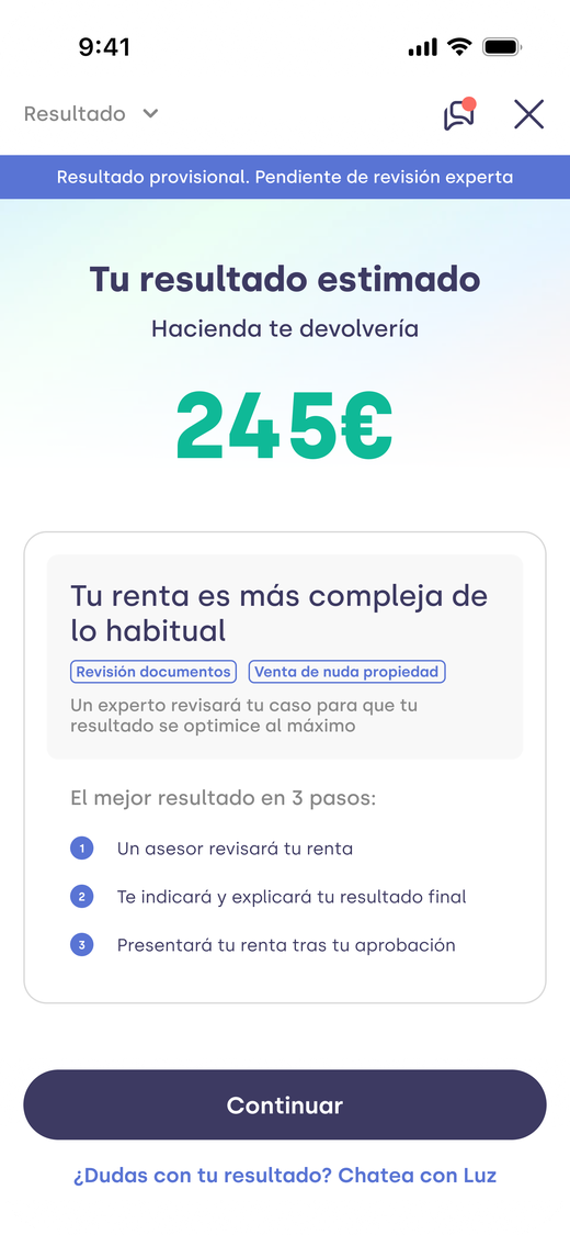

Explaining why turned waiting into trust
With no figure and no explanation, this was the worst-converting cohort. I added an estimated result, why their return is complex and 3 steps with a tax expert.
Step 2 · When the result can be calculated: AI
A generic message didn't work (Exp 2, reverted). What worked was explaining each specific case, and with so many scenarios that can't be written by hand: we generate it with AI.
- 01
Reads the scenario
Tax profile and difference from the draft.
- 02
An LLM processes it
Returns a structure, not free text.
- 03
Rendered in my design
In the slots I designed.
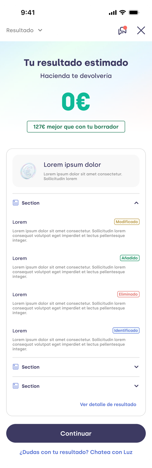
Scroll inside the screen
My role
I designed the mold, not the copy
The design is a placeholder: the content changes, but the AI always renders it in the slots I defined. That keeps the screen consistent and easy for users to understand.
- Result and color by type
- Difference vs the draft
- Generated explanation
- Report with labeled changes
- A single CTA
UI design · when the result can be calculated
The same structure for everyone, content tailored to each user.
"Congratulations!", "We're sorry" or "Even", with no explanation at all.
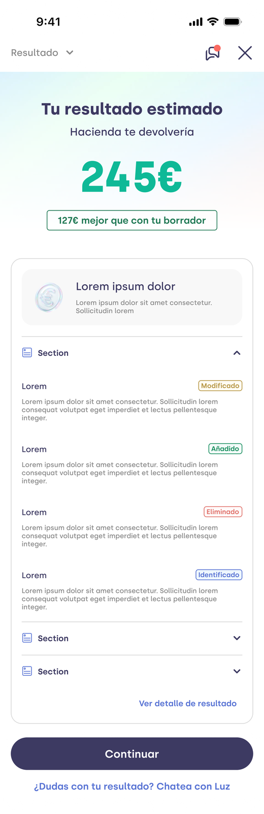

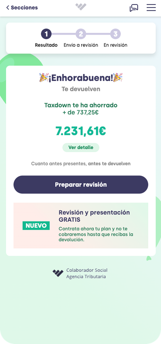
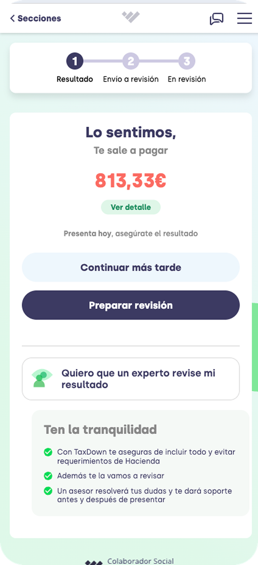
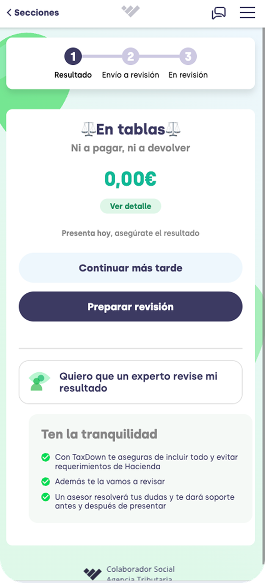
Scenario matrix · what the AI absorbs
Each user sees a different combination of type × plan × savings.
Under the hood · instrumentation
Measure what matters
The savings property hid the users who came out worse than the draft. A signed difference vs the draft let us segment the message, feed the AI and measure properly. A ~1-day change that unlocked the entire analysis.
Design principles
3 principles · tap each one
“Every result, its own message.” The content adapts to the result type and the tax profile: there's no one-size-fits-all Result.
“Nothing without explaining where it comes from.” Every figure shows what we did and how it differs from the draft.
“One screen, one decision.” Prioritize what helps users decide and strip out noise that doesn't add to conversion.
Key decisions
A personalized, AI-generated explanation against the draft
Exp 2 proved that a generic message doesn't move the needle. The prompt absorbs the combinations of scenarios and profiles instead of a hand-built message matrix.
Communicate the invisible work
Deductions, adjustments and scenarios applied. The "worse" case is reframed as a better review: we added data the Tax Agency didn't have.
Side-by-side comparison with the draft
It turns doubt into a visual answer. Scoped for the next iteration, since it depends on power of attorney.
Highlight the human review
What the tax expert will do for you. "I trusted it, but with doubts" is the dominant response.
Instrument with a signed difference
It complements the savings property to identify worse results, segment and measure.
Discarded alternatives
- Detailed next steps when the result can be calculated. Tested as Exp 2 and reverted: submission for review dropped 4.75%. We simplified the content to avoid adding noise at the moment of decision.
Trade-offs
- Partial comparison. Side by side is only possible with power of attorney; we prioritized explaining the difference on screen, which reaches every calculated result, over unreliable comparisons.
05 · Impact
The experiments validate the direction
Explaining moves the needle: strongly when the result can't be calculated, and when the result can be calculated only if the explanation is personalized, not with a generic message.
Three experiments · uplift vs control
Submission for review Payment
Where the number doesn't speak
+9.6%
in submissions for "same as the draft" and +4.4% in payment for "amount owed". For "refund", ~zero.
The precedent
67.5% vs 4.78%
submission for review with and without an explanation of why (~14×). Not an A/B test; Exp 1 confirmed it.
Year over year
8.6% → 10.4%
conversion to paid from Result: the combined effect of everything that changed on the screen.
In production
100%
The AI explanation has been available to everyone since July 6.
Smart Result didn't reach significance: the season ended with less than 10% of the target sample, and the payment lift held steady at ≈+20% until an external blocker before checkout contaminated the metric.
Before → after
What didn't work
01 · Generic message
Exp 2 was reverted. −4.75% in submission for review and +1.51% in payment, not significant. Without personalization, the needle doesn't move.
02 · Break-even (0)
Still the hardest hit (2.15% during the season). Smart Result shows its best relative signal there, but on a small sample.
03 · Restarts
Rose 1.31 pts, the only guardrail we missed. Still to be determined whether it's good or bad friction.
04 · Support
No data yet on the support impact: measuring the drop in discrepancy tickets requires a post-season window.
Learnings
Personalizing the message by scenario and profile from the design stage, and instrumenting with a signed difference vs the draft.
Treating Result as a single message for everyone and assuming that showing the figure is enough.
Explaining before showing, the pattern that worked when the result can't be calculated, and making the human review visible at the moment of highest decision.
Next step · Generative Result with AI
01 · Decide
Choose the final AI system: the two we compared tied on every metric; a tax-quality review is still pending.
02 · Extend
Bring the personalized AI explanation to when the result can't be calculated and let users interact with it, using the same components.
03 · Modularize
A screen that adapts the value information to each situation: previous years, member get member, security and comparison with the draft.
Want to dig deeper?