Smart Filter
The problem wasn't the questions, it was how the flow was structured
Redesign of the questionnaire that assigns each user's tax tier before the first payment, treated as a rule system rather than a sequence of screens.
TL;DR
01 · Problem
When the questionnaire assigned the wrong tier, users paid twice. And because the questions were hard-coded on a single screen, changing one meant a deploy.
02 · Solution
I redesigned the flow as a rule system: one question per screen, questions in configuration and the right tier applied before payment, without locking out people who want to try the product.
03 · Impact
Total double checkouts went down and conversion held flat. The cost was completion time, and among new users, double checkouts with a tier upgrade went up.
−1.0pp
Double checkouts, paying users · 10.2% → 9.1%
98.5%
Questionnaire conversion · flat against 98.62%
−3.2pp
Double checkouts among returning users · 16.0% → 12.8%
+132%
Median completion time · 28 s → 65 s, accepted trade-off
- Role Product Design Lead
- Team Product · Data · Engineering · Operations
- Scope Tax onboarding, before first payment
- Timeline Feb → Jun 2026 · two phases
01 · Context
The questionnaire that sets the price
The product
Smart Filter
The questionnaire every user completes before paying. It reads their tax situation and assigns one of five tiers which, combined with one of three service levels, sets the price.
My role
Product Design Lead
Accountable for the experience design and the structure of the flow. I defined the product model behind it so it could grow without blocking every tax season.
Timeline
Two phases, Feb → Jun 2026
Phase 1: a full rebuild for the 2026 season. Phase 2: a post-launch optimisation round, partially delivered.
02 · Business problem
When the tier is wrong, users pay twice
The tier is set before payment. When the questionnaire gets it wrong, users pay for the plan they were offered and then pay again to upgrade.
Mandatory plan change
50.6 → 31.0
NPS in the 2025 diagnosis: the most damaging double checkout.
Upsell
72.1 → 48.9
NPS when the second charge is an upgrade users chose, not a correction.
Double checkouts · 2025
10.2%
Of paying users paid twice in the same season.
With a fixed season window, a billing error is a trust problem that a patch a month later can't fix.
03 · User problem
"Yes, just in case"
Users want to get the plan right on the first payment. But the questionnaire showed several concepts on the same screen and didn't explain why each one mattered.
Confusion
"What is this asking me?"
Several concepts at once, with no context. More than half of all help-panel openings happened on the start screen.
Fear of getting it wrong
"Yes, just in case"
When in doubt, users said yes to the hardest questions, and that answer took them to a higher tier with no point to reconfirm.
Timing of payment
Paying before the data arrives
The deterioration concentrates on users who pay before we have their tax data: in June, almost one in four of those payments ended in a tier upgrade.
Evidence · billing and behaviour
Billing new paying users
+37%
Double checkouts with a tier upgrade went from 3.0% to 4.1% (relative, 2025 vs 2026).
Billing across the season
+2.2 pp
The gap with the previous year builds up: from +0.1 pp in March to +2.2 pp in June.
Questionnaire help panel
>50%
of openings, on the start screen. The residence question caused the biggest funnel drop, about twice any other step.
Timing of payment June
1 in 4
payments made before tax data was available ended in a tier upgrade, against one in five the year before.
Constraints · the limits I designed within
- A fixed season window Once live, it can't be iterated during the season.
- Tax data integration It couldn't change. Some data arrives pre-filled and some doesn't: the questionnaire had to handle both states.
- Price is a business decision The questionnaire applies tier rules; it doesn't set prices.
- Structural cost Decoupling the product data meant about two months of backend work, blocked by another project. It shaped the design decisions.
04 · UX Thinking
Not what to ask, but when, and with what structure.
Double checkout looked like a product problem, but its root cause was architectural: the questions were hard-coded on a single screen, and the rules that decide the tier were tied to the screens that showed them. Fixing the screen would have left the system unchanged, so I treated the questionnaire as a rule system.
- Lever 01
One question per screen
Users understand what's being asked and what their answer changes. Better understanding, better data.
- Lever 02
Rules in configuration
Questions are discovered from configuration: adding or changing one no longer needs a deploy.
- Lever 03
The right tier, before payment
Edge cases lead to the right plan before paying, without locking out people who want to see the product.
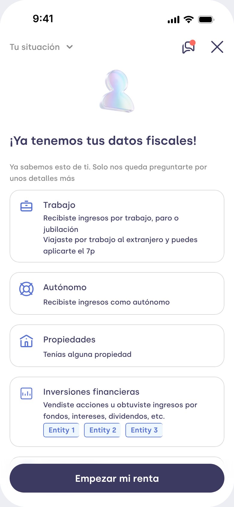
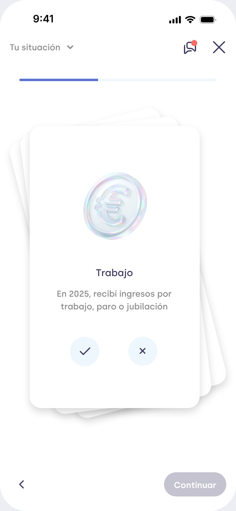
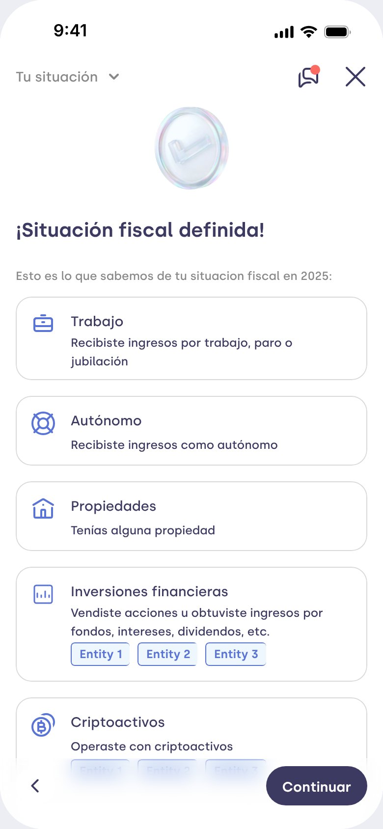
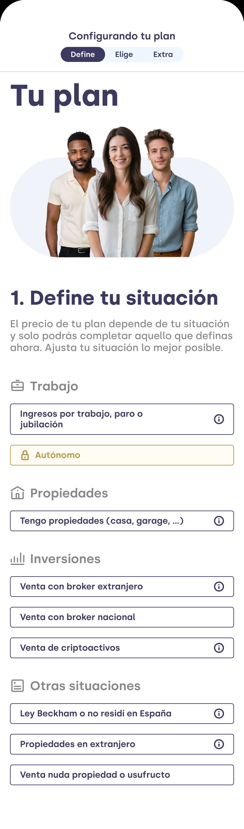
Before & After · from a page of chips to one question per screen
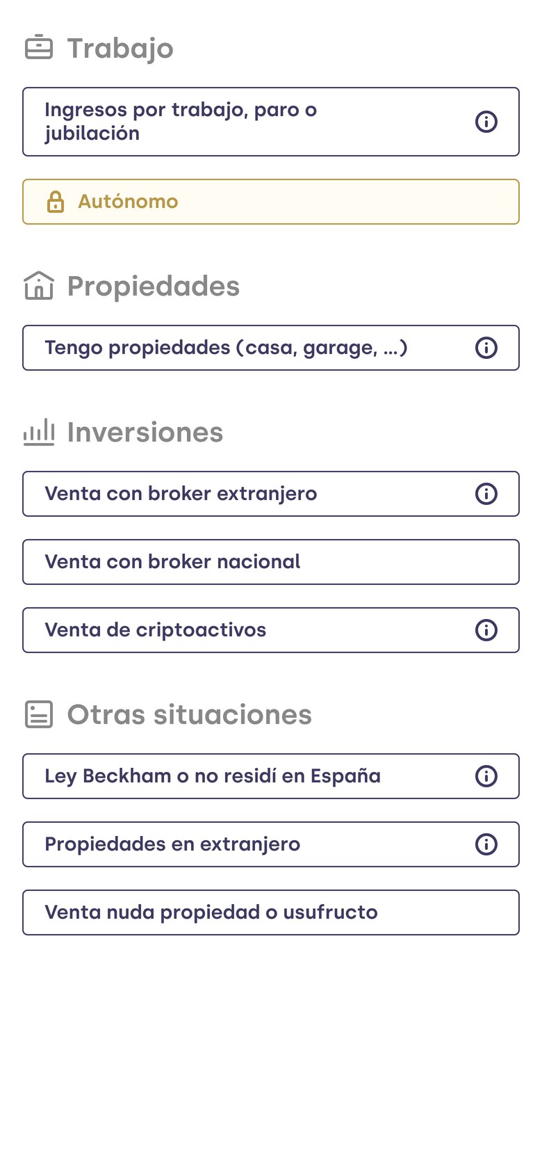
What we already know, in view; one question at a time; and a grouped summary before seeing the plan.
Situation and plans on the same page, with chips by category and an instruction to set the situation "as best you can".
UI and flow · interactive prototype
Explore the full flow
Ten steps: start, residence, employment, self-employment, property, crypto, investments, summary, plans and end. Pick a case and answer by swiping the card or with its buttons.
Use case
What to doPulsa Empezar mi renta.
The prototype is in Spanish.
Mandatory tier rules · the edge cases
Cases the questionnaire detects before payment, grouped by the plan they trigger.
Design principles
4 principles · tap each one
“Ask one thing at a time.” Each question gets its own screen, so users understand what's being asked and what their answer changes.
“Rules live in one place.” Configuration is the source of truth: adding a question shouldn't need a deploy.
“Protect the critical path.” The rules that decide price are explicitly reviewed before they change.
“Don't block the path that converts.” Users who need a higher tier can see the product before paying.
Key decisions
One question per screen instead of grouped chips
Several concepts on one screen forced users to guess. It improves understanding and data quality; the cost is completion time.
Questions discovered from configuration
Adding or changing a question no longer needs a deploy, so the questionnaire can evolve during and after the season.
Mandatory tier rules for edge cases
Where the system used to assign the wrong tier, users now reach the right plan before paying.
A contextual plan with the option to continue for free
Blocking everyone at the first payment would have cut conversion. Letting users try the product and warning them at checkout kept it flat. VIP cases stay blocked: they have a separate path.
The plans page, unchanged
It's the third best-converting content category. Touching it in the same season was a risk that didn't pay off.
Discarded alternatives
- Decoupling the tier data structure first. Right in the long run, but about two months of backend work blocked by another project, plus a data migration.
- Shipping only the investments setup. A patch on the symptom: it didn't fix the edge cases and kept the confusion of the chips.
- A conversational questionnaire. Explored in a five-day proof of concept and dropped in favour of the per-screen redesign.
Trade-offs
- Time for accuracy. The median went from 28 to 65 seconds. The right tier on the first payment avoids a second charge.
- Tier rules still hard-coded. Each question needs two configuration entries instead of one. Technical debt accepted for delivery speed; any change to a tier rule still requires review.
05 · Impact
Fewer double checkouts, same conversion
Total double checkouts went down and conversion held. The cost was completion time, and among new users, double checkouts with a tier upgrade went up.
Double checkouts · 2025 → 2026
2025 2026 · full season
Questionnaire conversion
98.62% → 98.50%
Flat, despite more screens.
Users who finish it
94.07% → 93.07%
−1.0 pp of users completing the questionnaire.
Full plan · proxy
6.48% → 5.76%
double checkouts on the Full plan, −11% relative.
The cost · accepted trade-off
28 s → 65 s
median completion time, +132%.
No A/B test and no control group. These are full-season cohorts, year over year, which include growth in new users, a mid-season price change and payments made before tax data was available. The impact of Smart Filter alone can't be isolated.
Before → after
What didn't work
01 · Tier upgrades among new users
Up 1.1 pp. They concentrate on users who pay before their tax data is available and on tiers that can change after payment. The questionnaire can't fully solve either.
02 · Completion time
More than doubled, from 28 to 65 seconds median. It needs watching as questions are added.
03 · Phase 2, in part
The investments setup optimisation and the second UX round are still in the backlog. Without closing measurement of the remaining double payments, its improvement can't be quantified.
04 · Mixed institutions
Still open. Providers that offer both crypto and shares aren't solved, and their volume could grow.
The root cause sits outside the questionnaire: with the tier model, price can change after payment. Removing tiers is a business-model decision, outside the scope of this project.
Learnings
Define closing measurement before the season starts. Without it, an iteration's impact can't be proven.
Judging the redesign by conversion alone. Completion time and plan upgrades are part of the outcome.
Sequencing the work in versioned milestones, each with an explicit rollback plan.
Want to dig deeper?

